

In a recent post (Analysis of live COVID-19 data – a MATLAB/Octave approach) I described how it is possible to analyse live COVID-19 data from reliable online data sources and create intuitive graphical representations.
Apparently, this task is also simple when using Python programming language. To this end, a Colab Python notebook was created to demonstrate the process, which is shared as an endnote to this post. Experienced Python users or those that do not need to look at the following description may skip straight to the endnotes section for that link…
First thing here is to select a reliable data source. For the purposes of this demonstration the data source selected was the European Center for Disease Prevention and Control, as those data are collected and fed by the “Our World in Data” project @ https://ourworldindata.org/coronavirus-source-data. In addition, official population data to be used for normalisation have been collected from DataHub.io (which are taken from the World Bank dataset.
At the beginning some initialisation is needed, as usual.
import pandas as pd
import requests
import io
from google.colab import files
from datetime import datetime

from pandas.plotting import register_matplotlib_converters
from matplotlib import dates as dts
from matplotlib import pyplot as plt
from  matplotlib import style

# select the default graph style
style.use('ggplot')
To read the current outbreak data we may use the pandas function read_csv as follows
url = 'https://covid.ourworldindata.org/data/ecdc/full_data.csv'
data = pd.read_csv(url,parse_dates=['date'],index_col=['date'])
The parse_dates['date'] parameter informs the parser that there is a ‘date’ field in the CSV data that is the date-time index for the time-series. Thus the ‘date’ field is transformed to an index and future references should address to it as data.index instead of data.date. This conversion informs Python that we are dealing with time-series and enables better plot visualisations.
Next we define the array of countries of interest (it can change to any number of countries as long as they are correctly spelled — as defined in the loaded CSV data)
locations = ['China','Italy','Spain','United States','Turkey','Greece']
In order to create multiple plots on the same figure, a strategy would require a loop for each of the countries, as follows
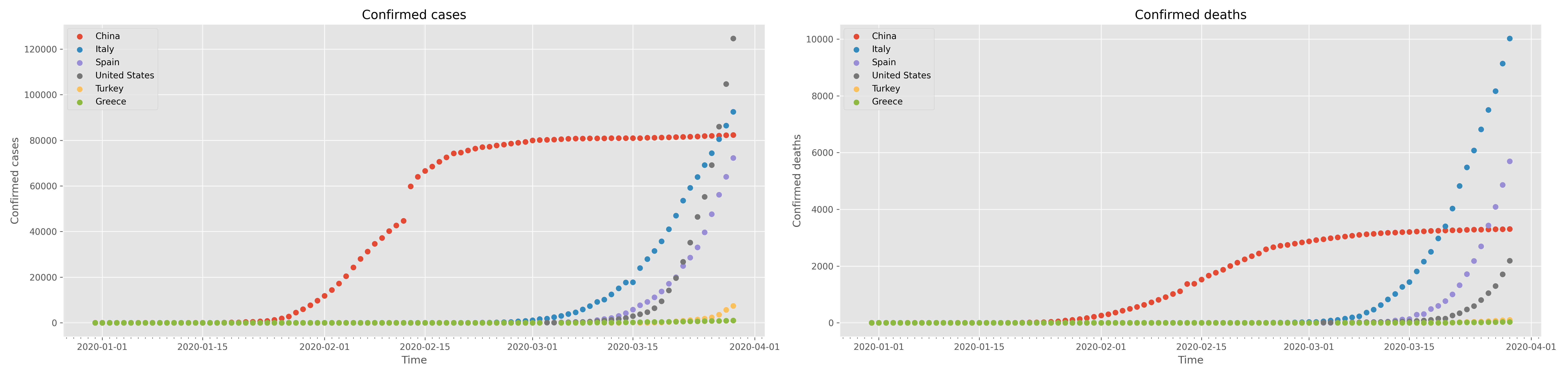
# define the figure and initialise it to a size
fig = plt.figure(figsize=(25,6))
# supposing we need to do two subplots one next to the other,
# define the subplot to the left; also define some basic parameters of the subplot
ax1 = fig.add_subplot( 1, 2, 1)
ax1.set_title( 'Confirmed cases')
ax1.set_xlabel( 'Time')
ax1.set_ylabel( 'Confirmed cases')
# define the subplot to the right; also define some basic parameters of the subplot
ax2 = fig.add_subplot( 1, 2, 2)
ax2.set_title( 'Confirmed deaths')
ax2.set_xlabel( 'Time')
ax2.set_ylabel( 'Confirmed deaths')

# run the loop for all countries
for loc in locations:
  # filter the data for a particular country
  df = data.query( "location=='"+loc+"'")
  # get the date field (now the 'index')
  x = df.index
  # create scatter plots for the total cases (on the left) and the total deaths (on the right)
  ax1.scatter( x, df.total_cases, label=loc)
  ax2.scatter( x, df.total_deaths, label=loc)

# display a legend for both subplots
ax1.legend(loc='best')
ax2.legend(loc='best')
# maximise the space the graphs will take inside the browser window
plt.tight_layout()
# activate the minor X axis ticks to represent days
days = dts.DayLocator()
ax1.xaxis.set_minor_locator(days)
ax2.xaxis.set_minor_locator(days)
# and finally display the figure
plt.show()
This will create the following figure
which may be saved and downloaded with
# create a timestamp for the file
datetimeSignature = datetime.now()
# create the figure filename
graphFileName = 'confirmed_data_' + datetimeSignature.strftime('%Y_%m_%d_%H_%M_%S') + '.png'
# save the figure
fig.savefig(graphFileName,dpi=300)
# download the figure
files.download(graphFileName)
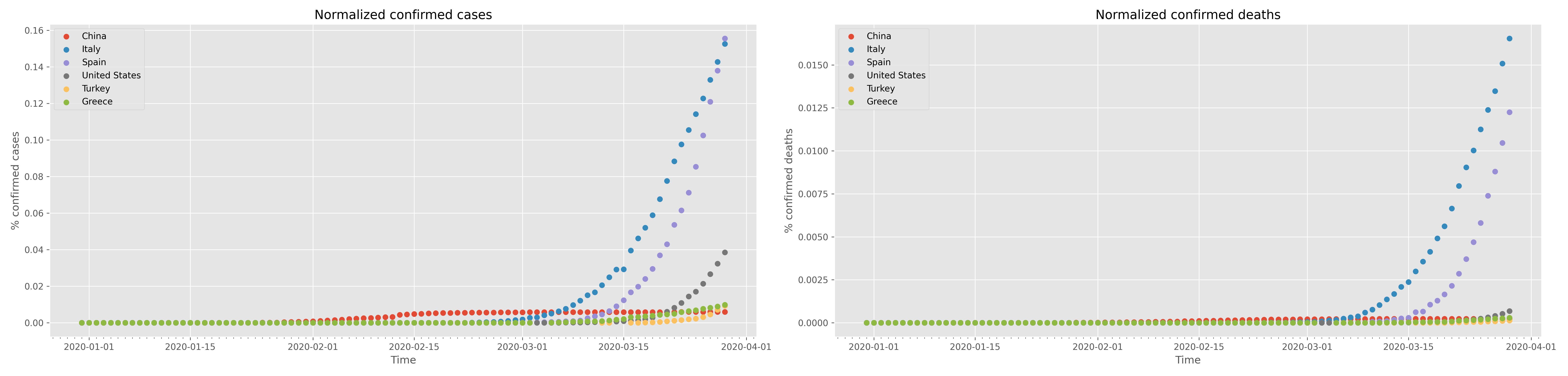
Next step is to demonstrate how to create graphs of normalised data using each country’s population as the normalisation factor. Apparently, this involves the loading of population data from reliable resources. In this demonstration, the datahub.io (world bank dataset) was selected as the resource for the data. Some modifications had to be done to be able to load the CSV data because pd.read_csv could not work straight away, like in the case of the COVID-19 data above. Let’s take a look
# Get population data from the datahub.io (pd.read_csv does not work in this case without the "requests" and "io" operations!)
url = 'https://datahub.io/JohnSnowLabs/population-figures-by-country/r/population-figures-by-country-csv.csv'
# use the requests and io libraries to download the data
response = requests.get(url)
fileObject = io.StringIO(response.content.decode('utf-8'))
# now read and parse the CSV data as usual
worldBankData = pd.read_csv(fileObject)
In those data the latest population data are in the last column of the worldBankData dataframe and can be accessed for the selected countries (stored in the locations array as follows
# initialise the populations array
populations = [0]*len(locations)
# run a loop for all countries
for idx,loc in enumerate(locations):
  # read the country population from the last column
  dp = worldBankData.query("Country=='"+loc+"'")
  populations[idx] = int( dp.iloc[:,-1] )
  #print("Country=='"+loc+"'", idx, populations[idx])
Plotting the normalised data follows the same iterative approach shown above, with one thing that changes being the need for the loop index as follows
for idx,loc in enumerate(locations):
  df = data.query( "location=='"+loc+"'")
  x = df.index
  ax1.scatter( x, 100*df["total_cases"]/populations[idx], label=loc)
  ax2.scatter( x, 100*df.total_deaths/populations[idx], label=loc)
Of course one should change the title and X, Y axes labels accordingly. The result of this graph is shown in the following figure:
Saving of this figure uses the exact same strategy as shown above for the confirmed cases.
ENDNOTES
*** The whole process is available as a Colab notebook for better inspection and experimentation. Please notice that the access to the live data may need a free account.
*** The featured image in this post is an illustration of COVID-19 by the Public Health Image Library
