

Analysis of (time-series) data being collected in (near) realtime often provides insight for a process underway. As the current situation with COVID-19 is still critical lots of data are being collected, curated and streamed throughout the world, and researchers strive to get the most out of them to identify patterns and, maybe, make predictions. In this post I am showing how to download and analyse live data using MATLAB/Octave.
First thing is to find the data sources, which should in any case be reliable. For the purposes of this post I am going to use two sources:
- open-covid-19.github.io (direct link to CSV data)
- data.world (direct link to CSV data)
Then, those data should be downloaded and parsed to be useful for processing and visualisation. In the scenario adopted in this post, what is of interest is to create a view of the confirmed cases and deaths normalised by the country population, for a selection of countries, in this case China, Italy, Spain, United Kingdom, United States of America, Greece.
Let’s take a look at the code that downloads and processes the data. Suppose we are considering the data from GitHub.
sourceURL = 'https://open-covid-19.github.io/data/data.csv';
live_data = urlread( sourceURL );
theHeaderFormat = '%s%s%s%s%s%s%s%s%s%s';
theDataFormat = '%D%s%s%s%s%f%f%f%f%f';
data = string2table( live_data, theHeaderFormat, theDataFormat);
data.CountryCode = categorical( data.CountryCode);
data.CountryName = categorical( data.CountryName);
data.RegionCode = categorical( data.RegionCode);
data.RegionName = categorical( data.RegionName);
confirmed_cases_column = 5;
deaths_column = 6;
population_column = 9;
data = table2timetable( data );
The conversion of some fields into categorical is not mandatory at this point. The auxiliary function string2table is transforming the string containing all the downloaded data into a meaningful table as shown in the following piece of code. The X_column variables denote the columns in the data table that contain the corresponding X data. The table2timetable just converts the table to a time series table.
function tabl = string2table ( s, headfmt, datafmt )
	Fields = cellfun(@(x) x{1}, textscan(s, headfmt, 1, 'Delimiter', ','), 'un', 0);
	theData = textscan(s, datafmt, 'Headerlines', 1, 'EndOfLine', newline, 'Delimiter', ',');
	tabl = table(theData{:}, 'VariableNames', Fields);
Then all we need to do is define the countries of interest and go ahead with the plots.
countries_of_interest = {'China','Italy','Spain','United Kingdom','United States of America','Greece'};
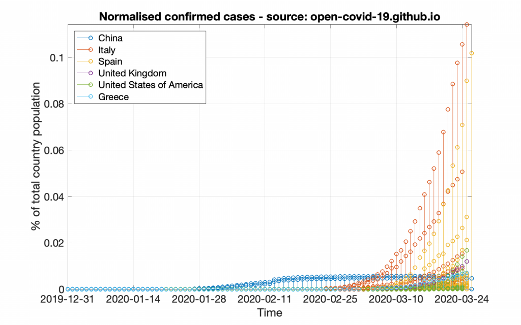
Suppose we want to create graphs, one for the normalised confirmed cases and one for the normalised reported deaths. The normalisation is supposed to be based on the respective country population, so that the graph actually corresponds to the power the country loses. First, let’s create the confirmed cases graph.
figure; hold on; set(gcf,'position',[1000 1000 800 500])
for c = 1:length(countries_of_interest)
	% read the confirmed cases column from the data
	country_data = data(find(data.CountryName==countries_of_interest{c}), confirmed_cases_column);
	% read the population column from the data
	country_population = data(find(data.CountryName==countries_of_interest{c}), population_column);
	% select the population reported in the first occurrence of a country
	population = country_population.Population(1);
	% plot the normalised cases as a percentage
	stem(country_data.Date, 100*country_data.Confirmed/population);
end
% make it a bit nicer
title( 'Normalised confirmed cases - source: GitHub');
legend( countries_of_interest, 'location','northwest');
xlabel( 'Time'); ylabel( '% of total country population');
set( gca, 'Fontsize', 16);
axis tight; grid on; box;
hold off;
This code will create a graph that will look like the following figure.
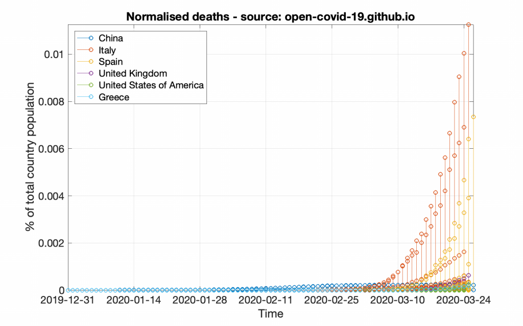
In pretty much the same way let’s create the normalised deaths graph.
figure; hold on; set(gcf,'position',[1000 1000 800 500])
for c = 1:length(countries_of_interest)
	% read the deaths column from the data
	country_data = data(find(data.CountryName==countries_of_interest{c}), deaths_column);
	% Read the population column from the data
	country_population = data(find(data.CountryName==countries_of_interest{c}), population_column);
	% select the population reported in the first occurrence of a country
	population = country_population.Population(1);
	% plot the normalised deaths as a percentage
	stem(country_data.Date, 100*country_data.Deaths/population);
end
title( 'Normalised deaths - source: GitHub');
legend( countries_of_interest, 'location','northwest');
xlabel( 'Time'); ylabel( '% of total country population');
set( gca, 'Fontsize', 16);
axis tight; grid on; box;
hold off;
This code will create a graph that will look like the following figure.
Following the same strategy, bellow are the respective graphs created by using the data provided by data.world (which may look a bit different from the previous graphs due to either more or less data).
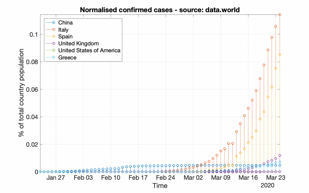
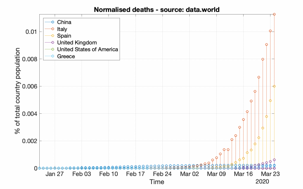
*** It should be noted that working with data from data.world is a bit different, as those data do not include population information; that information should be acquired from other resources.
*** Please note that no processing of the data is being done in this tutorial; the data include values per province and not per country, thus, one should process those values to extract meaningful conclusions!
*** The featured image in this post is an illustration of COVID-19 by the Public Health Image Library
